


When or how often should a business refresh its brand? Every three years? Every five? The answer is every so often.
Maybe you’ve gone through a substantial organisational restructure or a change in ownership. Perhaps you’ve acquired a new business or are entering a new market.
Maybe your look and feel is just tired and in need of a makeover.
Or maybe your look, once original, has been so heavily copied it now appears the industry standard.
Whether the reason is strategic or opportunistic, refreshing your brand is a way of subtly signaling to the market that something’s changed – presumably, for the better.
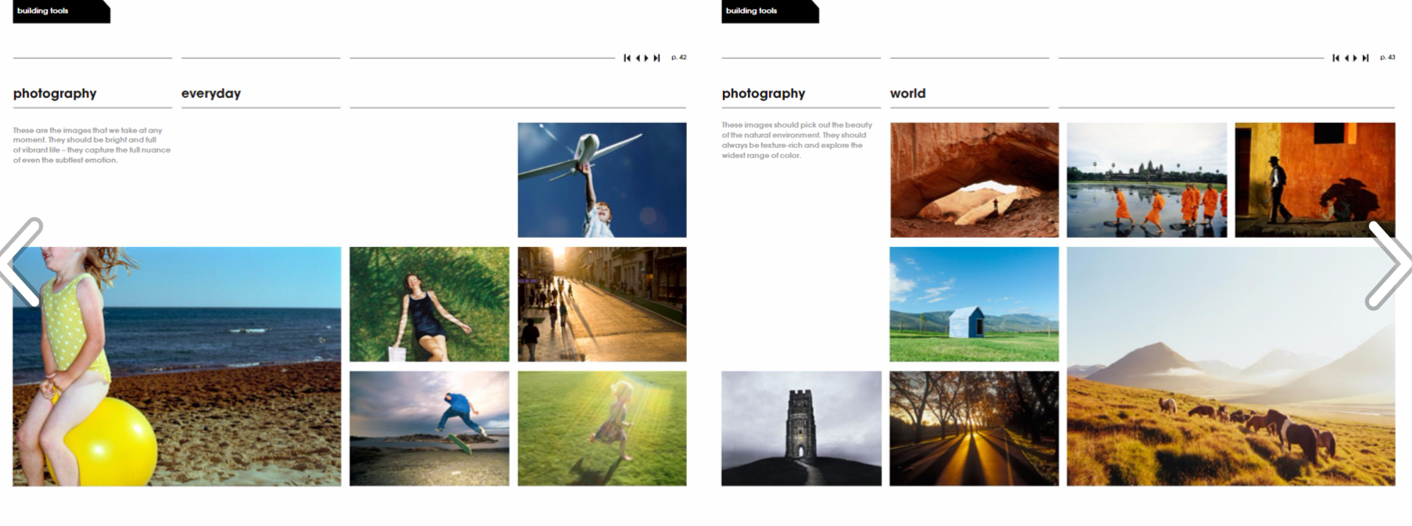
The first step is to identify what aspect of your brand needs updating. Is it what’s on the inside (your brand positioning, values or personality, for example), or what’s on the outside (how you visually present)?
Most of the time, a brand refresh will be initiated to address the latter – your visual identity. Colour schemes, typefaces and imagery all follow design trends and can therefore become dated.
The question you must then ask is does your entire visual identity need updating or just aspects of it?
Image is Everything
These days many marketers find their image guidelines date long before other elements of their visual identity. Here are three reasons why:
- Digital marketing and social media have brought imagery to the fore – impacting the volume of images needed. Consider how hero images (including vector graphics, illustrations and animated videos) have grown in popularity as headers, backgrounds and landing pages. Then add to that the volume of secondary images we use daily for blogs and social media.
- Technology has dramatically altered how we create and manipulate digital images – impacting the variety of images (photographs, graphics, illustrations, icons, videos) we have at our disposal.
- We know now that vision trumps all other senses – impacting the importance of the images we use:
“We are incredible at remembering pictures. Hear a piece of information, and three days later you’ll remember 10% of it. Add a picture and you’ll remember 65%.” – Dr John Medina, Brain Rules
Image Guidelines: Create and Curate
As is the case with other forms of content, marketers can create (commission) or curate images. Most businesses will at the very least commission the basics – the informational images such as headshots of their executive team and hero images of their products.
Beyond those informational photos, unless you have a substantial budget for content creation, stock photography will be your most viable option.
The good news is stock imagery has come a long way in the last number of years – in large part thanks to the sharing economy and the willingness of professional and budding photographers and digital creators to make their images available at no cost, or low cost.
Hence, the challenge is not sourcing images, it is sourcing the right images. Here are some things to consider.
Context
Images are intended to add additional context to your content, not to contradict or confuse. Make sure every image you choose is relevant and serves a purpose.
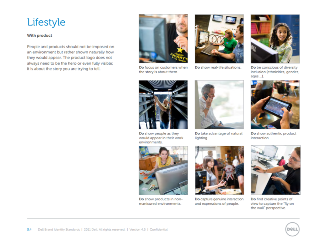
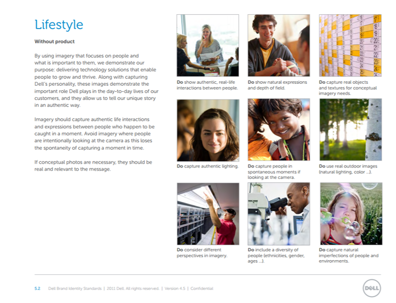
Example: Dell
Dell’s photojournalistic style provides “an authentic and unobtrusive look-in on real life as it happens…documents a real life or story and allows vulnerable imperfections to show through. It also creates an intimate connection between the subject of the photograph and the viewer. The best images leave a lasting impression because the viewer relates to the subject of the photo.”
Harmony
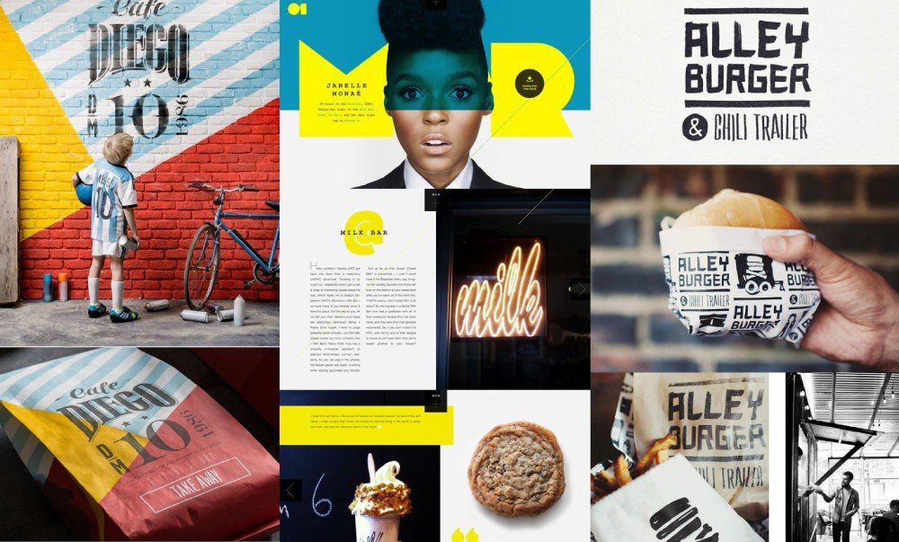
Whether you are creating new brand guidelines, or updating existing ones, keep in mind that every aspect of your brand must be cohesive. This extends to your visual content – it, too, must harmonise with your brand’s voice, style and personality.
If your brand is clean-cut and youthful you would select images of fresh faces, and of young people who are well-groomed and behaving appropriately.
If your brand is strong and masculine, your imagery should be so, too.
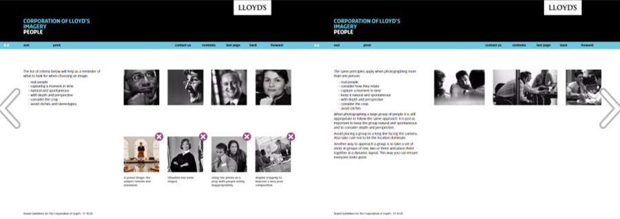
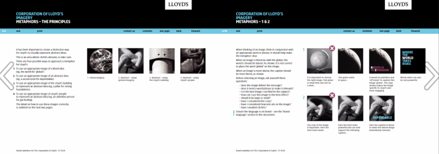
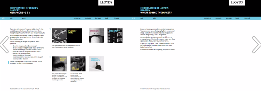
If your brand is constant, assertive, confident and original, like Lloyds, the imagery should reflect those attributes.
Example: Lloyds
Audience
No matter what product or service you are marketing, always keep your target audience in mind. Choose images that your buyers and influencers will relate to, understand, be drawn to. Try to appeal to their aesthetic preferences. The mood of the visuals should resonate with your audience and the surrounding content. What emotions does the visual evoke? How does it make you feel?
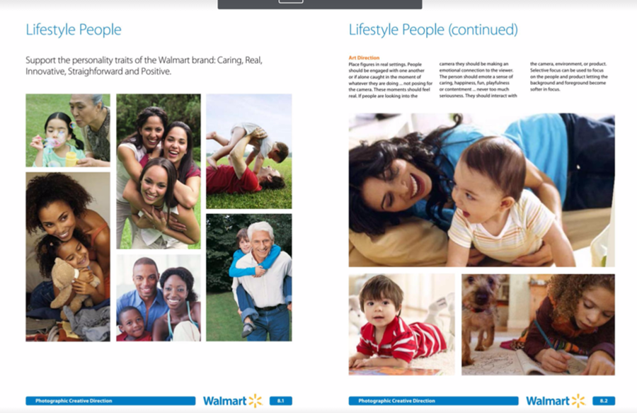
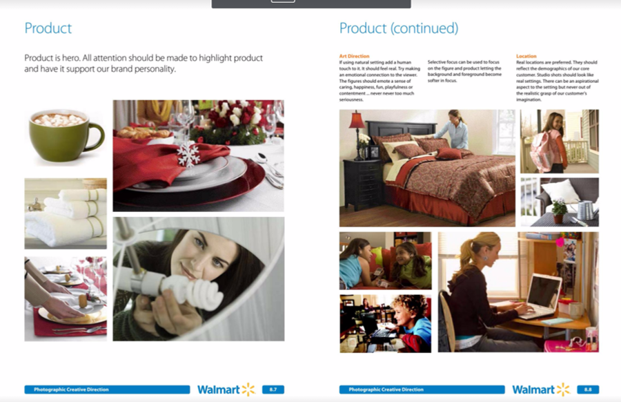
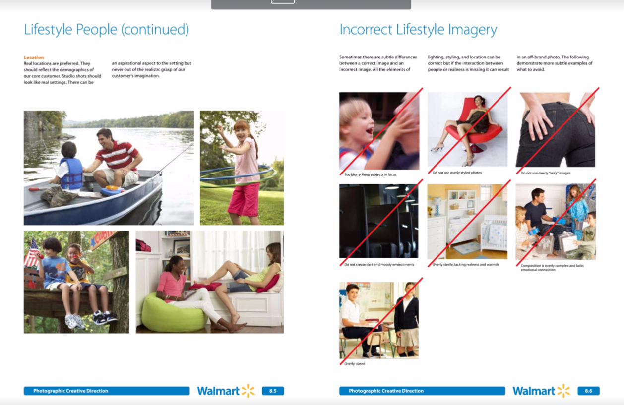
Example: Walmart
Consistency
If you’ve developed brand guidelines you will have a colour palette. One of the best ways to maintain consistency is by applying your colour palette to your images too. According to brand savvy photographer Jocelyn Mandryk, this is the most obvious, yet also the most difficult guide to follow.
Examples: Jocelyn Mandryk
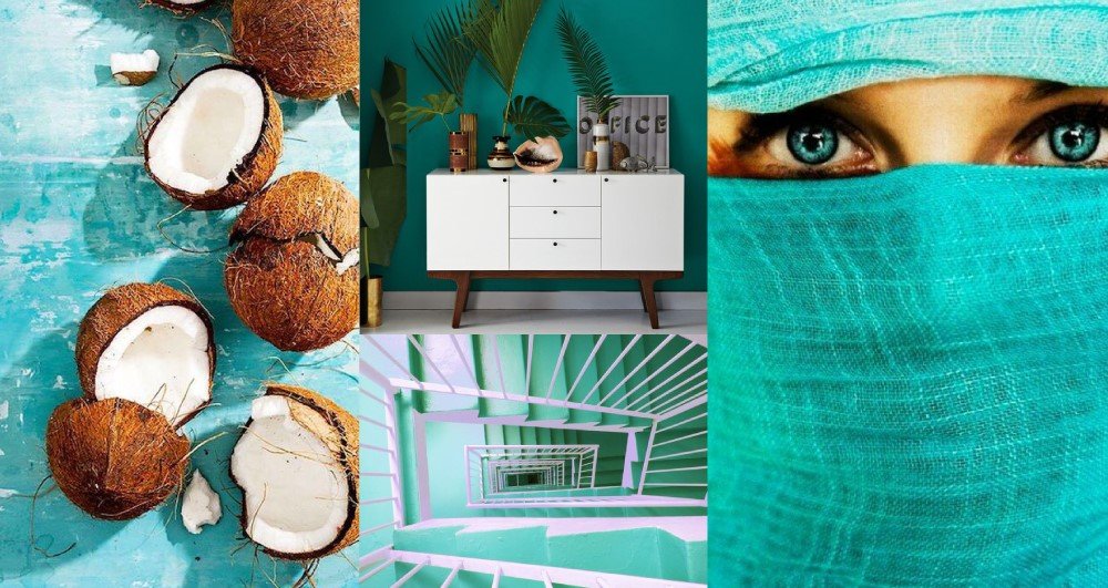
Sites such as iStock are helpful as they allow you to search by colour irrespective of whether you’re searching for photographs or illustrations.
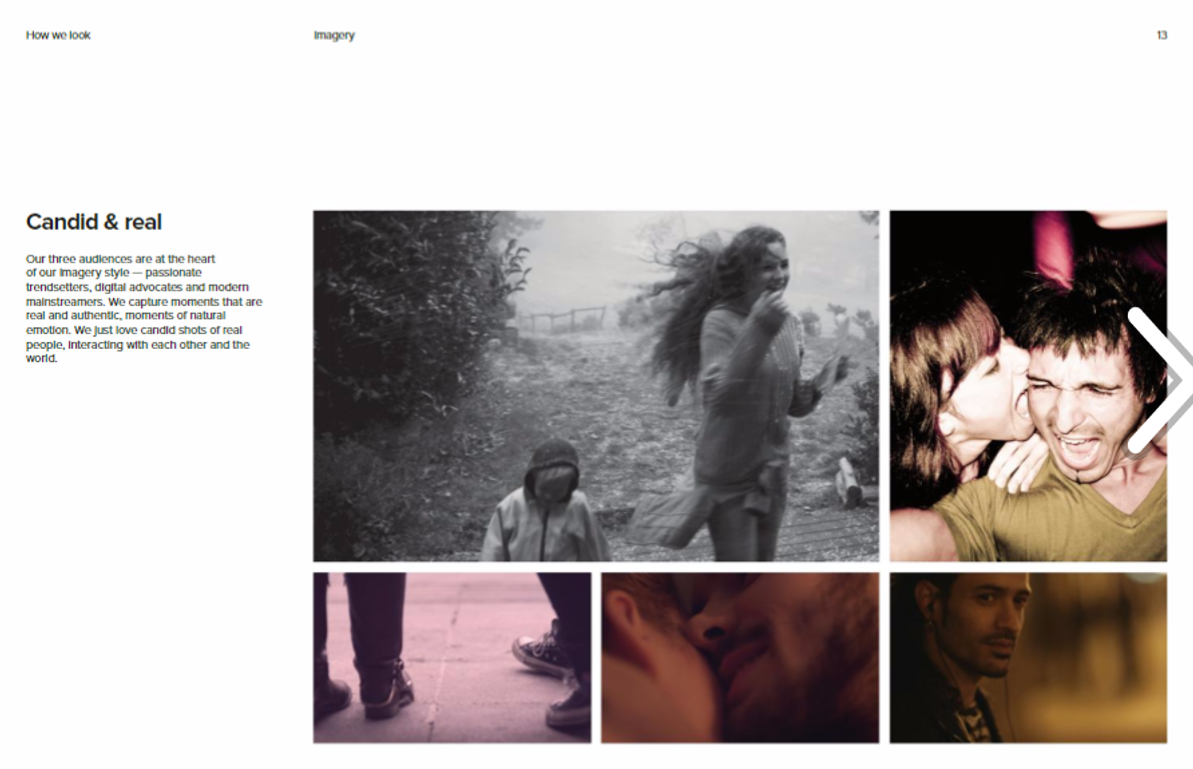
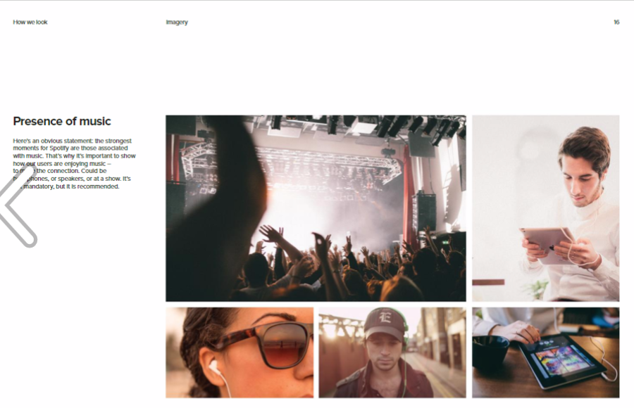
Authenticity
Authenticity is one of the most important things to keep in mind when choosing imagery to associate with your brand. Authentic images don’t look contrived, staged or gimmicky. They convey real emotion, capture real moments, and feature ‘real’ people, as opposed to models. Hence, they’re sometimes described as voyeuristic.
Example: Spotify
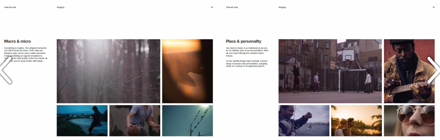
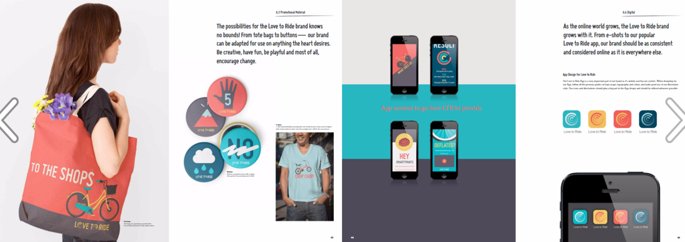
Originality
The only way to guarantee originality is to commission or create your own imagery. If you’re curating images, you accept the risks that are inherent in working with stock photography. Mitigate the risk by searching for and selecting images that are not over-exposed, generic or cliched.
Example: Love to Ride
Style
The style of imagery you select will be influenced by more than just your colour palette. You will also need to consider other factors, including
| Emotion | serious, playful, funny, happy, sad, goofy |
| Genre | street, portraiture, candid, documentary, conceptual, landscape |
| Format | photography, illustration, vector, video |
| Style | blur, clean, bright, modern, colorful, muted, authentic, retro, double exposure, geometric |
| Tonality | high contrast, low contrast, ratio, high key, low key, colourful, warm, cool |
| Filters | instagram, vintage, sepia tone, retro, Polaroid, vignette |
| Composition | framing, positioning, orientation, framing, minimal, layered, symmetrical, centred |
| Perspective | selective focus, macro, wide angle, landscape, top view, aerial, horizontal, vertical, square, over the shoulder |
| Environment | lighting (studio or natural), indoors or outdoors |
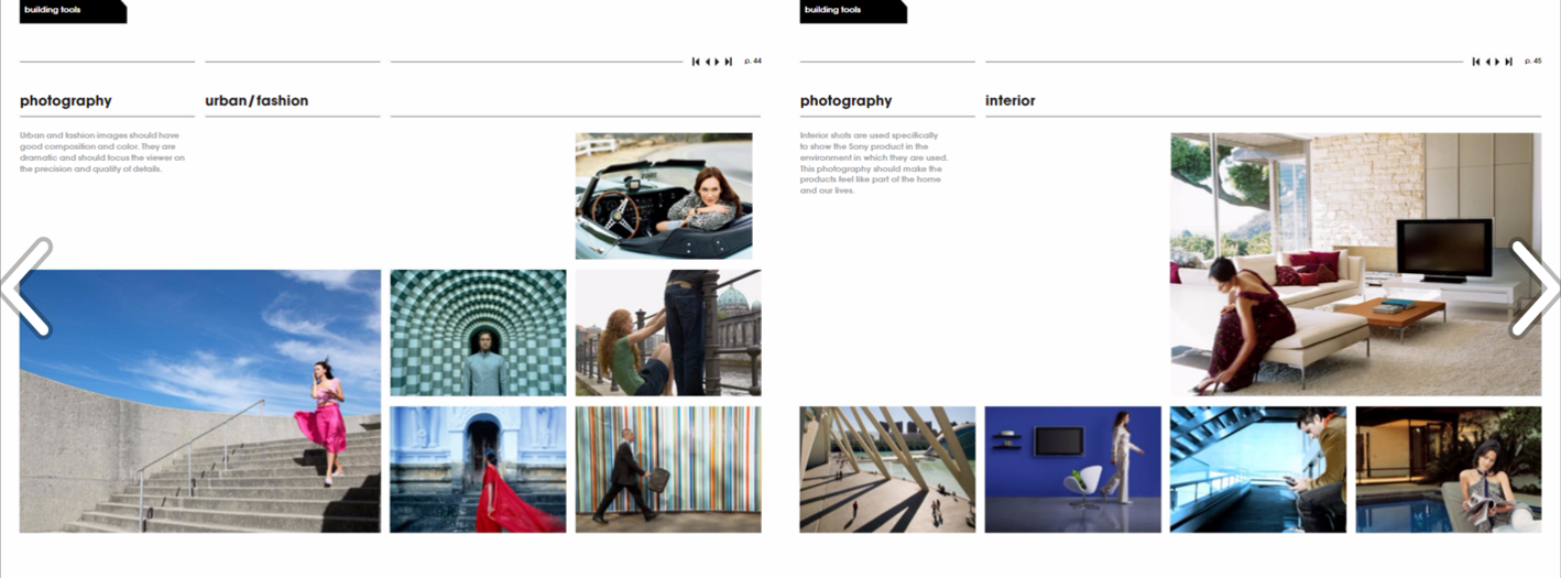
Example: Sony
Sony’s photography is “iconic and offers an unexpected perspective through unique content, lighting, focus, cropping or composition”.
Resources
There’s no shortage of stock images online, starting from no cost to those that are licensed or for editorial use only. Hubspot curated a tidy list of some of its favourite sites not long ago. Your challenge will be finding the sites that contain images that embody your brand and are fit for purpose. Then, get clever about searching, filtering and editing your images so they stick.
Need more inspiration? This freelancer.com.au blog showcases 100 examples of stunning brand guidelines.
Do you have a favourite image style? Favourite image guidelines? Tell us in the comments below!
